Social Graphics Guidelines
You can also refer to our accessible color chart to know which colors can be combined.
Social Graphic Rules
When creating your own social graphics, follow these rules.
Keep things simple and straightforward.
Make all content accessible.
- Use colors that meet contrast requirements
- Keep graphics readable
- Use a focused message
- Include alt text
What is the point of your message?
- Keep it succinct
Best Practices for Social Graphics
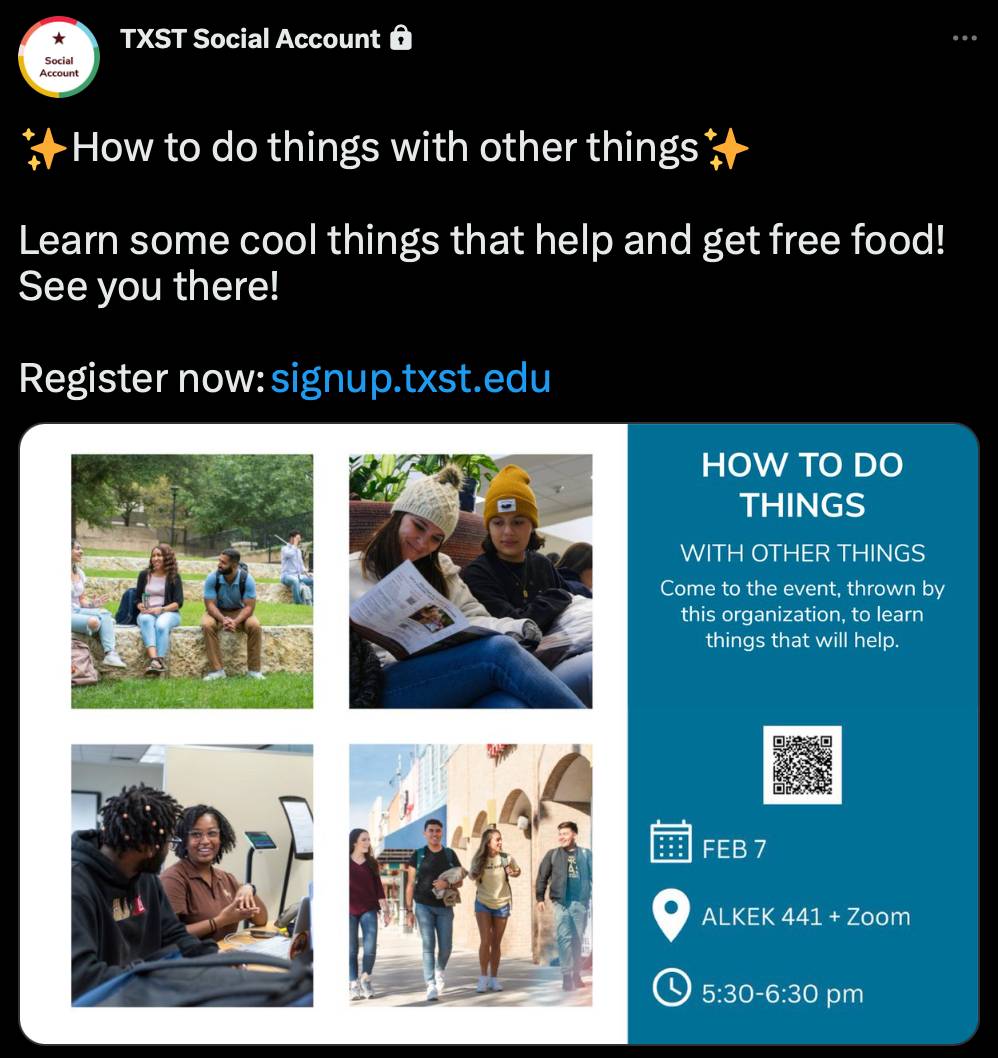
Never use QR codes
Because most people use mobile devices when viewing social media, they will not be able to scan a QR code embedded into your graphic.
QR codes should only be used in print, never social.
Instead of QR codes, use accurate links within post text or your bio.
Before
After

Use graphic elements sparingly
Branded TXST graphic elements are text heavy, so be careful not to overuse them. You should also avoid repetition of brand elements.
Before

After

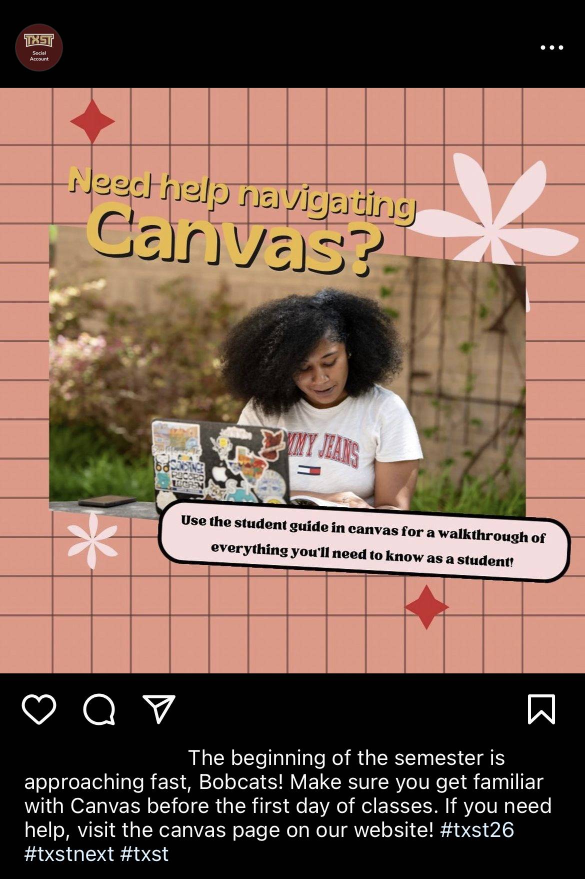
Use simple backgrounds
Busy backgrounds distract from your message. Rely on photography instead.
Before
After

Avatars & Logos
Do not use avatars on social graphics. For more information read our guidelines for using social avatars.
It is permissible to use Academic and Administrative logos on social graphics. For more guidelines visit our Academic and Administrative logos page.
Before
After
Avoid flattened copy
Flattened copy is text on digital assets that has been turned into an object. Assistive devices and programs cannot recognize flattened copy as readable text. When adding copy to a graphic or post, consider the following:
Do
- Put statements or detailed messages on your website and link to the site in your social post.
- Make a video statement with captions.
- Use Twitter threads.
- Use 6 words or less on graphics.
- Check color contrast when combining colors.
Don’t
- DO NOT post text-heavy graphics.
- DO NOT share in your feed (add time-sensitive posts to your story or daily tweets).
- DO NOT post your flyer meant for print.
